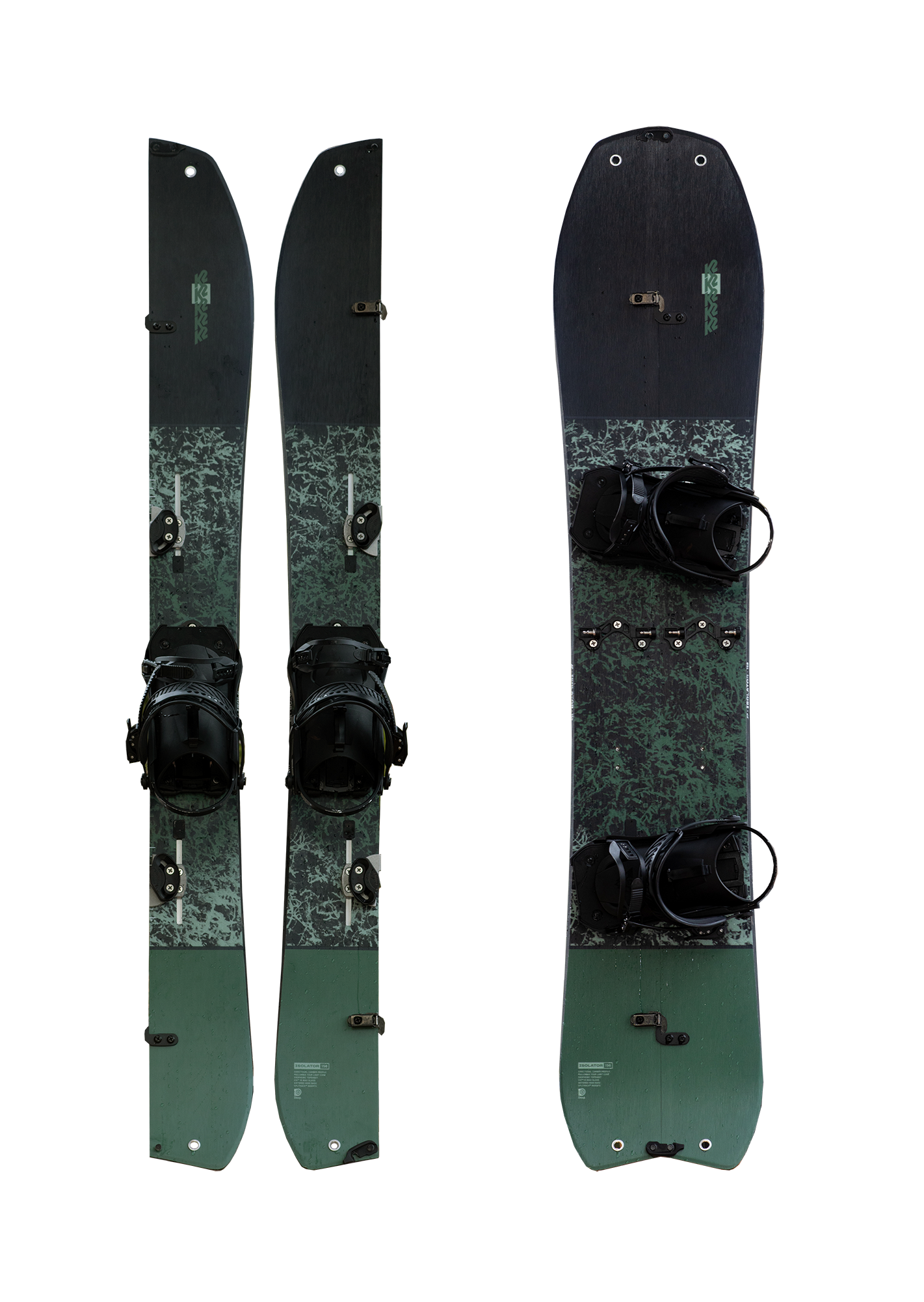
Imagine a new form of transportation that combines exercise and beautiful snow filled descents. There is a new invention that allows snowboarders to explore mountains freely while riding untouched fresh powder.
Enter - the splitboard.
Duration :
6 months
Role :
UX Researcher & Designer
Tools :
Figma, Miro, Marvelapp, Photoshop, Illustrator, Google forms, Otter ai
Project Description :
Solo student project under consultation from a Senior Product Designer
Research & UX UI, interviews, sketches, wireframing, high fidelity mockups, usability testing, prototyping
Methodologies :
Screener survey, Interviews, Empathy maps, Affinity mapping, Journey map
Introduction :
Splitboarding is a sport similar to snowboarding that combines hiking and snowboarding and has seen a dramatic increase in popularity due to advancements in equipment.
Problem :
Because splitboarding is new, acquiring the necessary expertise, and establishing the essential social connections to engage in the sport safely continue to pose difficulties for newcomers and experienced enthusiasts alike.
Solution :
Flurry provides location based connection building, knowledge sharing and shareable gpx data (gps route information).
I/ RESEARCH
Secondary Research
I researched consumer industry articles on splitboarding and backcountry touring to understand demographics, growth factors, and enthusiast decisions.
Primary Research
I conducted interviews to better understand the needs, pain points and motivations for users who had experience backcountry touring in avalanche conditions. I used a screener survey to narrow down and find participants who had lived the experience of becoming knowledgeable about backcountry touringh
Screener survey - I sent out screener surveys to 30+ people. I wanted to identify users I knew were interested in backcountry touring and additionally to people who knew nothing about the sport.
Interviews - From the survey I chose 5 people to participate in an interview that lasted 30 - 60 minutes. I chose to interview 5 users as this would allow for in-depth conversations with users to express their thoughts, opinions, and experience on backcountry touring in detail. After my 5th interview, I noticed that my findings amongst interviews were becoming similar and no more interview participants were needed.
What did I learn from the interviews?
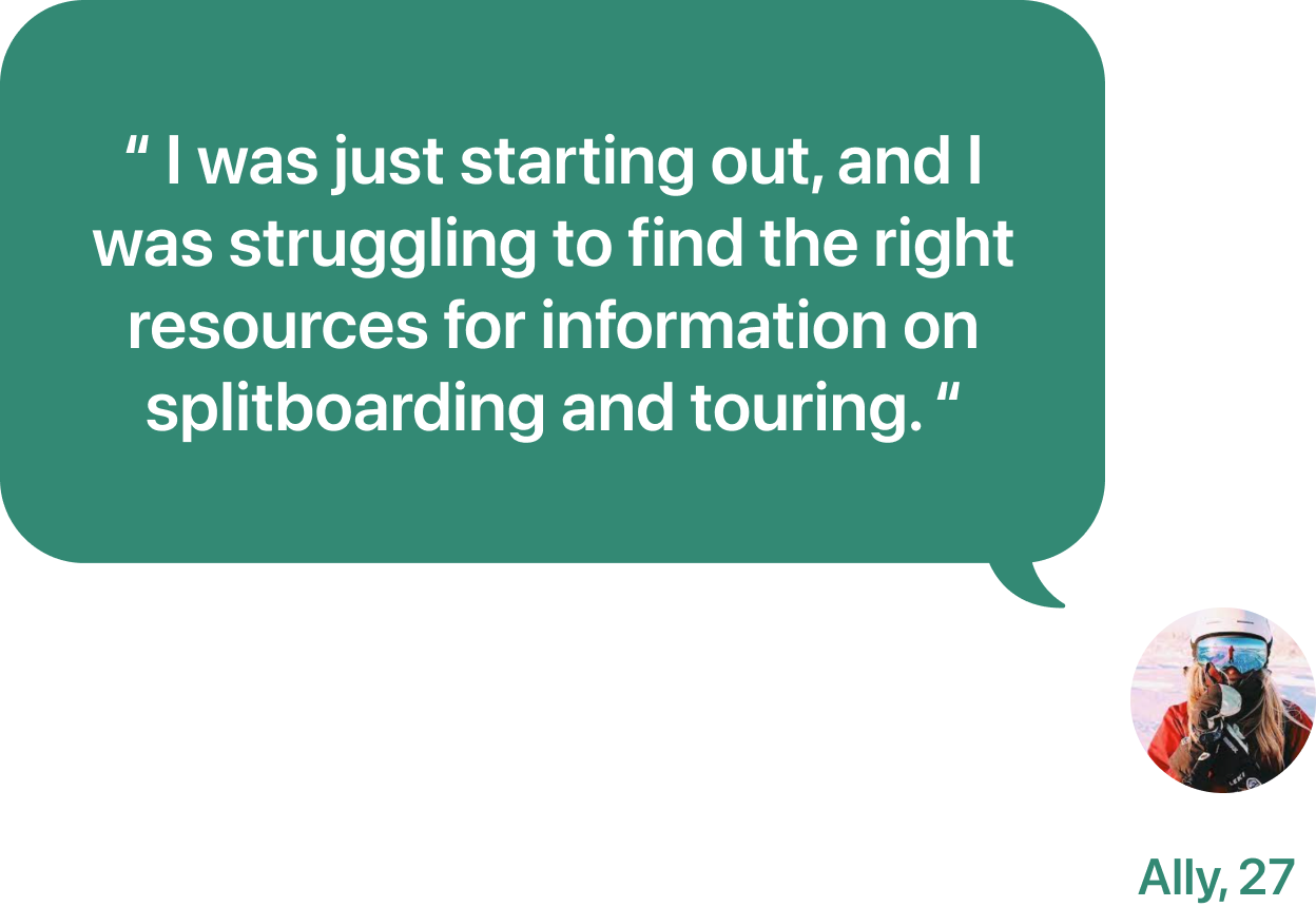
New users don’t have the best opportunity to research and practice with their touring gear before taking their first avalanche course.
It’s not easy to connect to a community of backcountry touring people. Mentorship is necessary for progress in the sport.
Newcomers and seasoned recreationalists need a dedicated resource for information on the subject.
3 Key takeaways from Affinity maps
1. All users need more knowledge of terrain, safety gear and splitboarding techniques prior to trying splitboarding
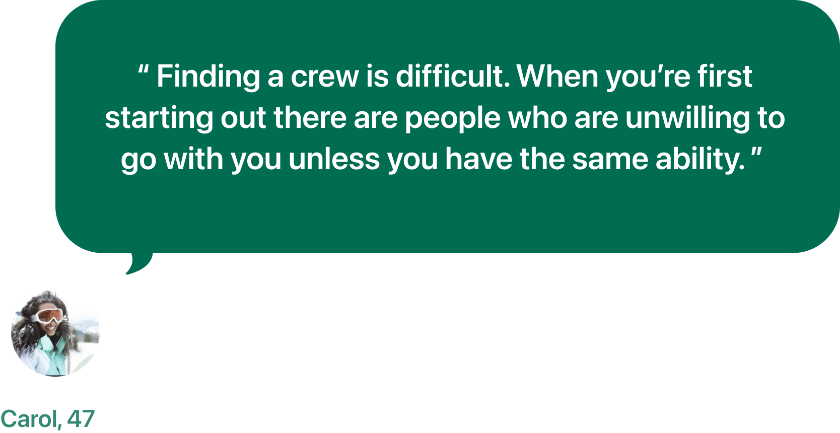
2. Users have difficulty finding others to ride with and share their knowledge with
3. Users can find it challenging to find riding partners who share the same comfort comfort level
Personas
Aaron
“ So it wasn't until I met some friends that motivated me to splitboard —Then I was like, oh, I could do this with friends. Then I took the classes and got the gear “
Age
Occupation
Location
Education
37
Game designer
SF, California
Bachelors degree
Motivations
Practicing avalanche safety, rescue awareness, and evaluating the snowpack are the most important aspects of splitboarding to him.
Fresh snow
Nature
Exploring
Exercise
Friendship
Pain points
Finding a crew, learning to use the gear, acquiring gear, inexperience, and ability to find their own voice in decision making in the backcountry.
Favorite brands
Empathy Map
Insights
I want to acknowledge my inexperience and recreate with others who share my values and comfort level.
I don’t want to hurt myself due to my inexperience.
I want to feel prepared and knowledgeable when first going out with others.
Pain
Still need to be more knowledgaable
Has trouble finding people to ride with
Needs to ride with people on their comfort level
Still needs more expensive gear
Gain
Feels confident touring in backcountry
Enjoys the positive social experience of touring with others
Becomes knowledgable about backcountry touring
Enjoys learning and teaching others
Jobs to be done
Improve my knowledge of splitboarding and become a better splitboarder
Main Job
Meet and go touring with splitboarders and practice your skills
Related Job
Emotional Job
Find someone who is on my comfort level that I can learn from or teach
Competitive Analysis & Heuristic evaluation
3 apps reviewed - Powder Project, Gaia, Strava
No apps currently exist that offer what I am proposing. Strava would be the main competitor as it provides a social media platform for sports enthusiasts that can show personalized routes that users have explored as well as the ability to follow and add friends. However, Strava focuses on all sports and is not specialized in back country touring.
How might we create a starting point for people looking to begin splitboarding?
How might we connect splitboarders who share the same aspirations and comfort levels?
How might we allow users to become more knowledgeable about gear?
II/ IDEATION
Potential Solutions
Create a network of splitboarders where they can create their own profile and assess their own skills. Splitboarders can make a choice of having their profile public or private. They can create a repertoire of skills, gear, and log the areas that they have ridden. They can post tips, reviews, and routing information.
Allow users to explore and connect with other splitboarders via an app or website.
Allow for users to plan meetups or practice to expand their skills.
Allow splitboarders to chat with one another, gain information on areas and how to access.
Create a database of ski touring areas
Create reviews for backcountry touring gear.
User Stories
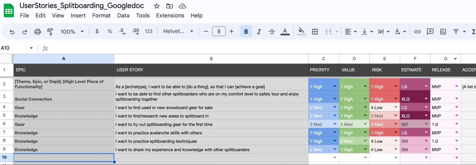
Through the ideation stage I was able to create user stories. This allowed me to focus the project from the perspective of those who will use it. Creating user stories help me stay concentrated on user goals and what can be implemented at this stage in the project.
user journey for entry to backcountry
Site map
With the user stories, I was able to create a site map for the app. The site map gave me the foundation to begin building my user flows.
User flows - miro
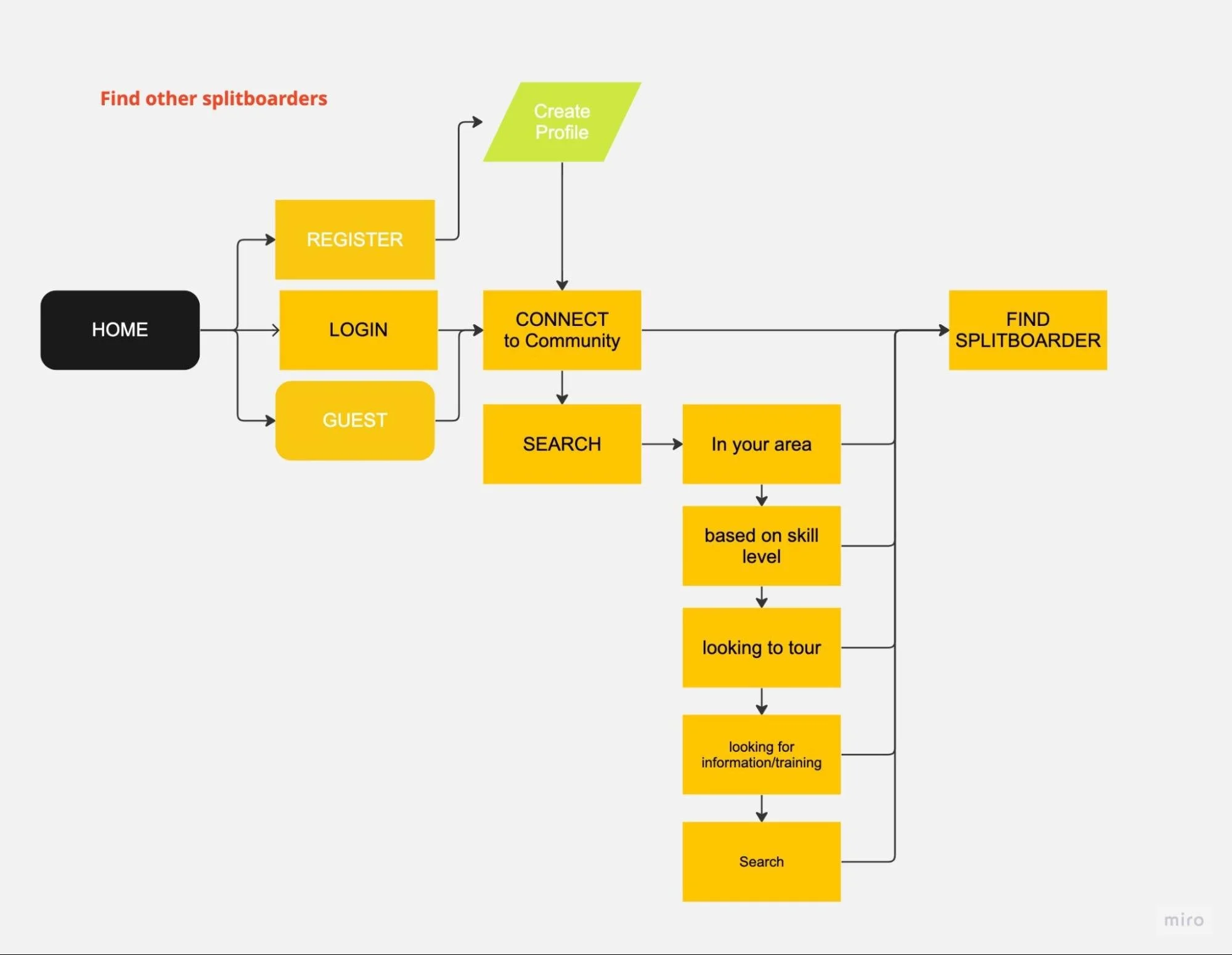
After reviewing user stories and the site map I had created. I focused on creating 3 user flows.
Flow 1 - Find another rider in a new area to tour with
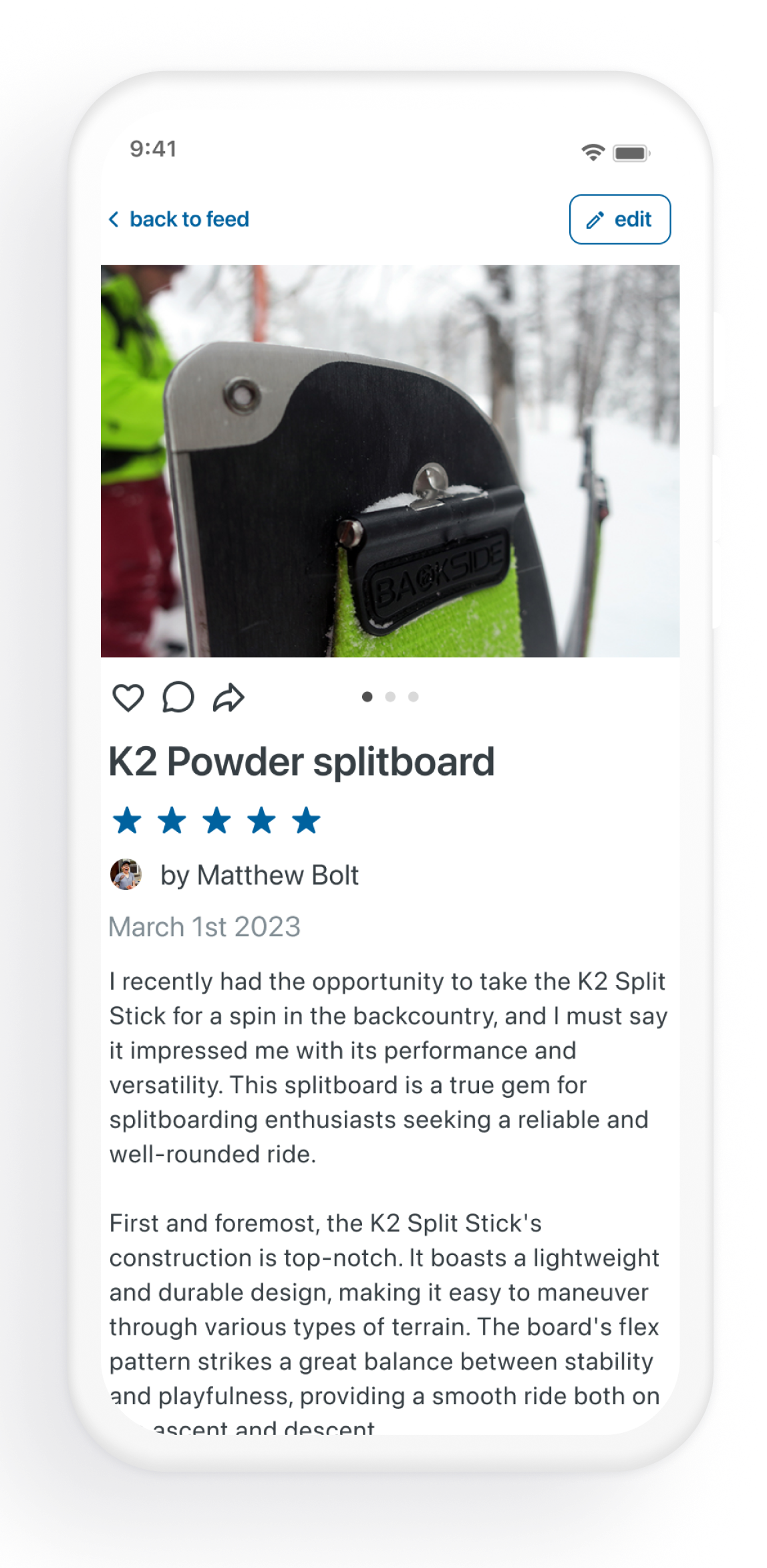
Flow 2 - Post a review of a splitboard to share with others
Flow 3 - Look up a new area to tour in
Sketches
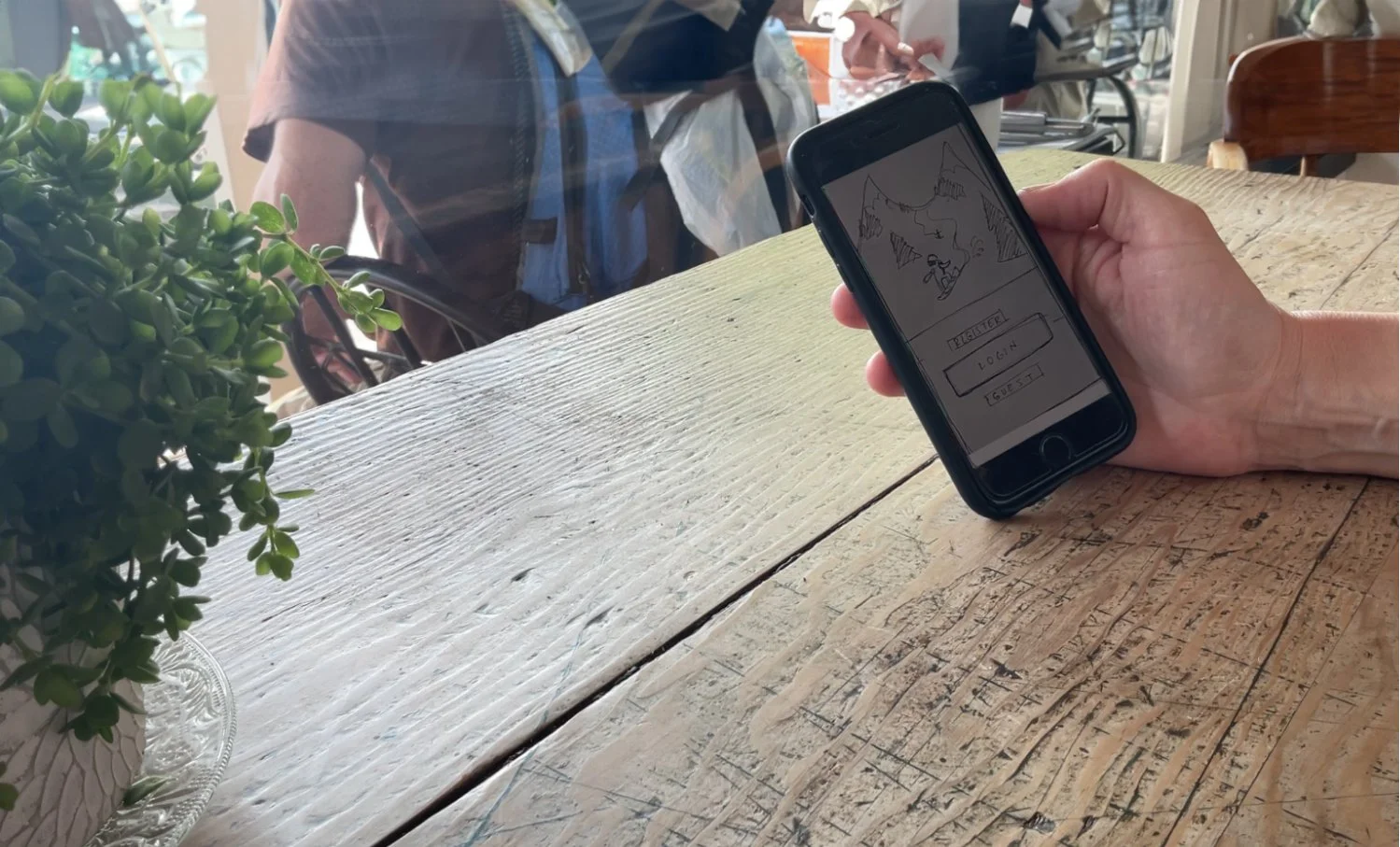
I created quick sketches based on my user flows and red routes for the goals I wanted my users to accomplish. Sketching was a fast way to make my ideas tangible and testable during guerrilla testing.
Guerrilla testing
From my initial sketches, I created a prototype using marvel. I visited a local coffee shop where I found 5 users to test my app with.
What I learned from the guerrilla testing
The home page will need to be simplified. I should condense the visible options to “feed” “explore” “connect” and “profile”.
Having content on the home page with a few examples from each category might seem visually appealing but it is counter intuitive for how the user interacts when creating posts and searching. This also leads the user to a dead end. My thought for improvement would be having the explore feature allow users to search/post/view content from each category and also having a “feed” with posts in chronological order and a filter for proximity so people don’t end up seeing posts that are not relevant.
The “connect” button is not noticeable and also the “+” button is not intuitive, these need to be larger. Participant 3 also said that in another app, he was not interested in seeing content from strangers and would only like to see content from his friends.
My goals for the guerrilla testing
I was hoping to find out if my prototype was intuitive or not, whether the language on the buttons I chose was good enough for users to complete the tasks. I also wanted to find out if users could easily flow back and forth within the app to complete the task.
Wireframes
My next step was to create wireframes. Creating low fidelity digital versions of my sketches allowed me to identify critical design decisions that I needed to make while still offering me the flexibility to make changes later.
Wireflows
After designing wireframes, I created wireflows to match my initial user flows. The matching of flows to wireframes allowed me to better understand the interaction users would go through to complete tasks.
User arrives on explore page, user will see a general map area of where they are located. They can choose to explore the map user will see numbers indicating where routes are located
User can select to show routes, reviews or events
User narrows down search by clicking on an area that has a number indicating reviews are there, once they select a number that number changes appearance and a list is shown with images and text for each route/post
User selects route via list below or clicking on GPX drawn route on map portion of screen to reveal more details and full post route review.
Flurry ❆ brand personality
Attributes
Knowledge, connection, self-improvement, comfort level, honesty
Colors
Inspiration
Imagery
Fonts
Font Family - SF Pro
Designer - Susan Kare
Foundry - Apple Computer
Icons
simple icons as well as custom icons for backcountry touring users
Custom vector art
I created custom vector art for the flurry app
Components
I created custom components and a design system for flurry
What I learned
A design system is an ongoing process. As my design became closer to a testable high fidelity prototype, I made updates, changes and re-iterated buttons, icons, and the visual assets of the flurry app.
Transformation from sketches, to wireframes, to high fidelity
What I learned
Creating an app is an ongoing process. As my design became closer to a testable high fidelity prototype, I made updates, changes and re-iterated buttons, icons, and the visual assets of the flurry app.
High Fidelity Mockup
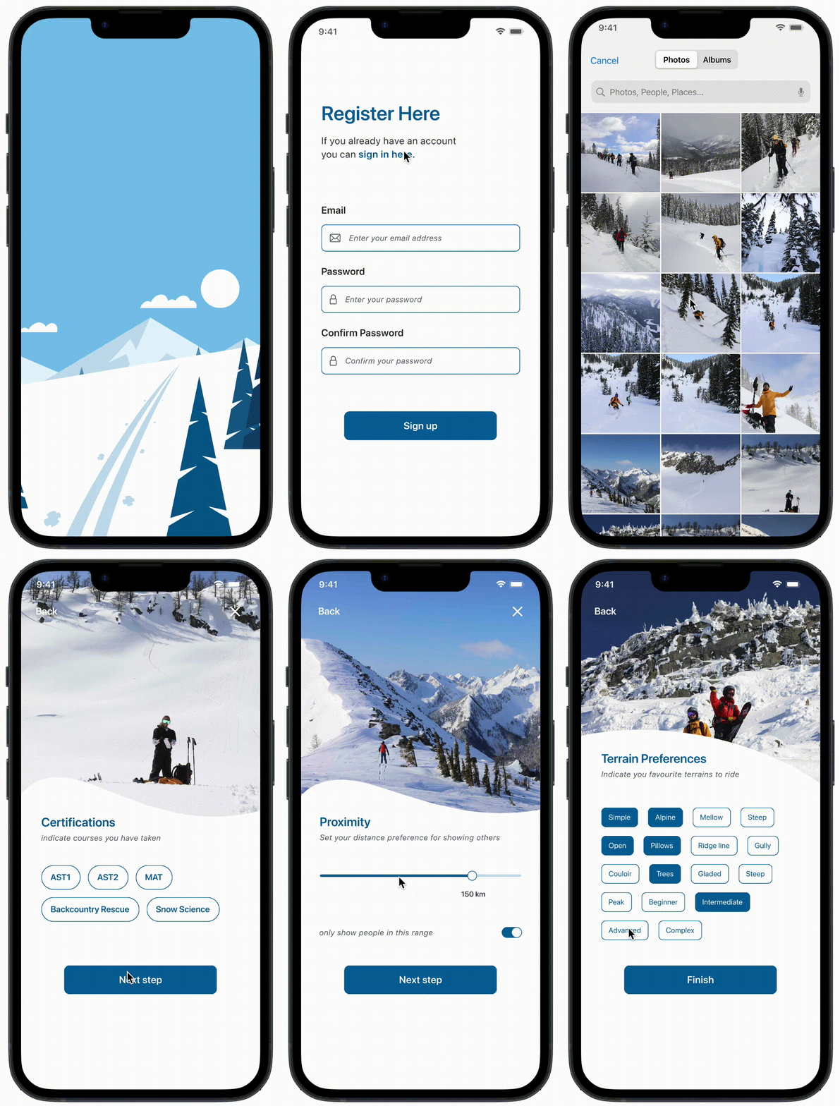
Intro screens for high fidelity mockup
High fidelity screens for Flurry
III/ TESTING
First round of testing
Testing Objective: My objective for the usability testing sessions is to demonstrate that this application can be a useful resource for those interested in backcountry touring. I would hope to gather insight on how to make it more useful than it currently is. I would also like to get a general impression from testers on the UI and flow of the app. I would also like to identify any usability problems in my red routes.
Tasks: I created 3 tasks for my prototype testing
You have been riding a new splitboard for a few weeks and would like to share a review of the board with others.
You are planning a trip to Mt Baker, Washington to go splitboarding. You have never visited the area before and would like to reach out to locals and make a friend to ride with.
You want to look up some routes for backcountry touring in Rogers Pass, BC Canada
How tests were conducted: I tested 5 different users in a local brewery. At the beginning of the test I simply asked users if they had experience in backcountry touring. Luckily all of my participants were familiar with the sport. I briefly explained what the app was supposed to do then reassured them that they did NOT have to fill out their own information and that the app was not live. After this, I asked users to login to the app and watched how they did with the login. Once logged in, I gave them the 3 tasks to complete.
What I learned from testing: Here are my main takeaways from my tests
Login screen is a challenge for some users. Users do not want to upload a photo to create an account.
Filter buttons for searching for posts, and user accounts is challenging. Instead of using the search bar, users were drawn to 4 filter buttons immediately.
Users expressed interest in seeing privacy functions.
The prototype I created could have been more advanced. For one of my tasks, I had users search for a certain area, I wanted them to use the search bar, they could have alternatively used a more interactive advanced map to complete this task.
What I changed:
Users did not want to upload a photo to create an account. I made a prompt in the app that reminds them they need to upload their profile pic before continuing. I also made the “next” button disabled until a profile picture was selected.
I changed the filter buttons. I made it one expandable button that then shows the list of the filters.
For the map, and option to search locations, I simply changed the language of the task to be more specific about how they could perform the search.
Example of changes from first round of usability testing
Filter button before
usability testing
Filter button after usability
testing changes
Filter button expands
for filter options
Second round of testing
How tests were conducted: 4 interviews were conducted at a local brewery and 1 interview was conducted on zoom
Main takeaways:
The same issue occurred with users not wanting to upload a photo to create their account.
Language for the tasks is important. I originally had asked users to “share a review” of a snowboard. This was confusing since the way to create a review would start with selecting the “+post” button. This confused some users.
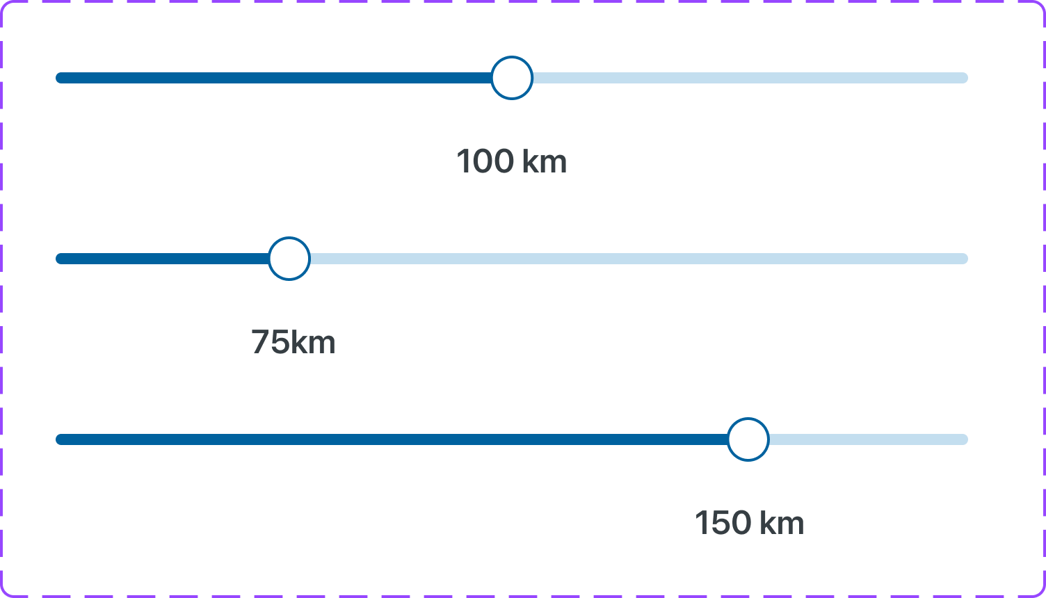
More options for filters. I designed my prototype with filter buttons for proximity. The new expandable filter button worked and I should consider creating more functionality to the rest of the filter buttons.
More considerations for changes:
Users did not want to upload a photo to create an account. A prompt to do so is ok, but an option for a place holder avatar should be available. People want to sign up fast and check out the app before committing to creating a profile.
Choosing language for tasks is complex. Be careful of the words you use to describe the tasks you want to complete. Use language that is descriptive and reflects the language found in your screens.
For the user flows I focused on in my prototype, I should consider fleshing out more functions and flows that users might want to see. For instance, I created this app to connect locals, and did not think to use this as a task. I should consider adding this simple task to my prototype. I should add full filter options and test this. These were my primary MVPs to begin with. I should consider maps that are similar, I have too many different map types. I should also consider privacy settings for users.
Figma Prototype
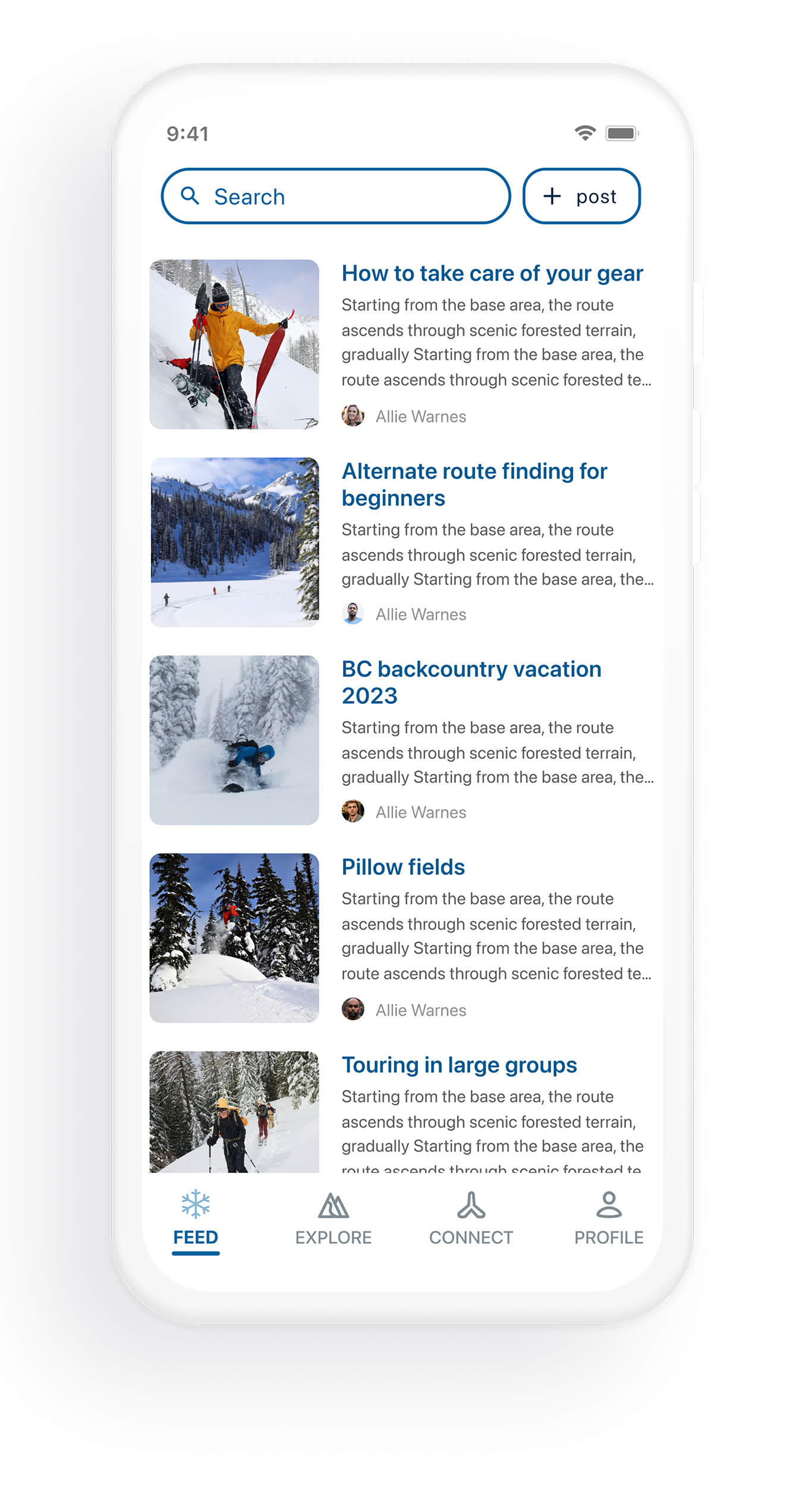
A sample of user making a post on the flurry mobile app
Flurry version 2 — post testing design
Because of the difficulties users faced in tests 1 and 2 I have made an option for users to not upload a photo and instead choose from a selection of avatars so that they may sign up faster and are more likely to check out the app. I changed the way the user can select the filter button when searching. I made this change because when users saw the four filter buttons displayed when performing a search, they immediately are drawn to this design. When there is one expandable filter option, they consider using the search bar more.
Things that I would add or change
I would add privacy settings to my prototype. Splitboarders like to keep their powder stashes secret and only share with certain individuals. I would add gamification to the prototype that encourages users with status points when they make a post or interact with posts. I would like to make a few more user flows in my prototype that test other functionalities of the app.
Conclusion
Originally, I wanted this app to solve all of the problems I found in my research. Cost of splitboarding is one of the main challenges. I wanted to have a portion of the app dedicated to buying and re-selling gear to help more people get into the sport. I chose to not include a buy and sell feature and instead focus on the MVP - which is the connection of the splitboard community and advancement of the sport.
I spent a lot of time thinking about linking up rider schedules. This thinking proved difficult to create in my wireframes and hi fidelity versions. I wanted users to show when they are “available” to go touring. I made these screens, but ultimately abandoned this idea for my final prototype as it seems too complex for users to understand. I think this feature is great and it could be something to give more consideration to as an added premium feature.
What I learned
I was surprised to learn that many users are more interested in only seeing posts and content from their friends exclusively and not the general public. I should consider this in my next iterations of the flurry app.
I also learned that there are many ways to complete the tasks I asked users to perform. The more testing I did, the more I realized that I was leading them down the path I wanted them to follow. I learned that I should create a more dynamic prototype with multiple options for completing tasks.

